When a tech luminary like Marques Brownlee, aka MKBHD, announces an app, expectations naturally soar. Known for his meticulous reviews and a keen eye for detail, MKBHD’s foray into app development with “Panels” promised a curated wallpaper marketplace featuring artist-approved backgrounds. However, upon release, the app left much to be desired. Enter Juxtopposed, a talented UI/UX designer who not only critiqued the Panels app but also offered a comprehensive redesign that transformed it from a clunky experience into a seamless delight.
First Impressions Matter: The Website Fumble
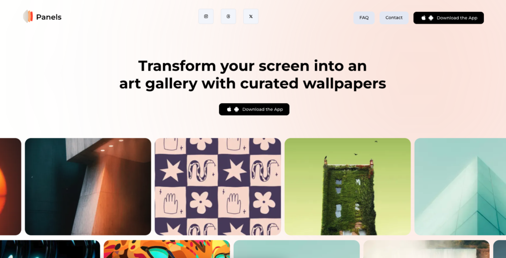
Our journey begins with the Panels website—the digital handshake between brand and user. One would anticipate a site mirroring MKBHD’s signature polish, yet it felt more like a hastily assembled draft. The layout lacked hierarchy; headings blurred into paragraphs, and navigation links led to dead ends. The site’s heavy load impeded smooth scrolling, especially on slower connections. It was an unexpected stumble from someone renowned for high production values.

The Onboarding Hurdle: A Clunky Setup Process
Upon downloading the app, users were immediately met with friction. The setup process asked users to select five artists from a list of fourteen to personalize their feed. The catch? There was no way to preview the artists’ work or learn about their styles. It was akin to choosing a book without seeing the cover or reading a synopsis. For an app centered around personalization and aesthetic appeal, this blind selection process was a glaring oversight.
Navigating the Labyrinth: Core Sections Misfire
Panels is divided into three main sections: Home, Explore, and Account. In theory, this straightforward structure should simplify navigation. In practice, it fell flat. The Home page, supposedly tailored with personalized suggestions, appeared barren and disjointed, with favorites and purchases awkwardly positioned. The Explore section, the heart of any discovery-based app, was hampered by design flaws—a tiny, almost invisible search button and inconsistent iconography with mismatched styles and border thicknesses. These inconsistencies detracted from the user experience, making the app feel unfinished.
Sticker Shock: A Misjudged Monetization Strategy
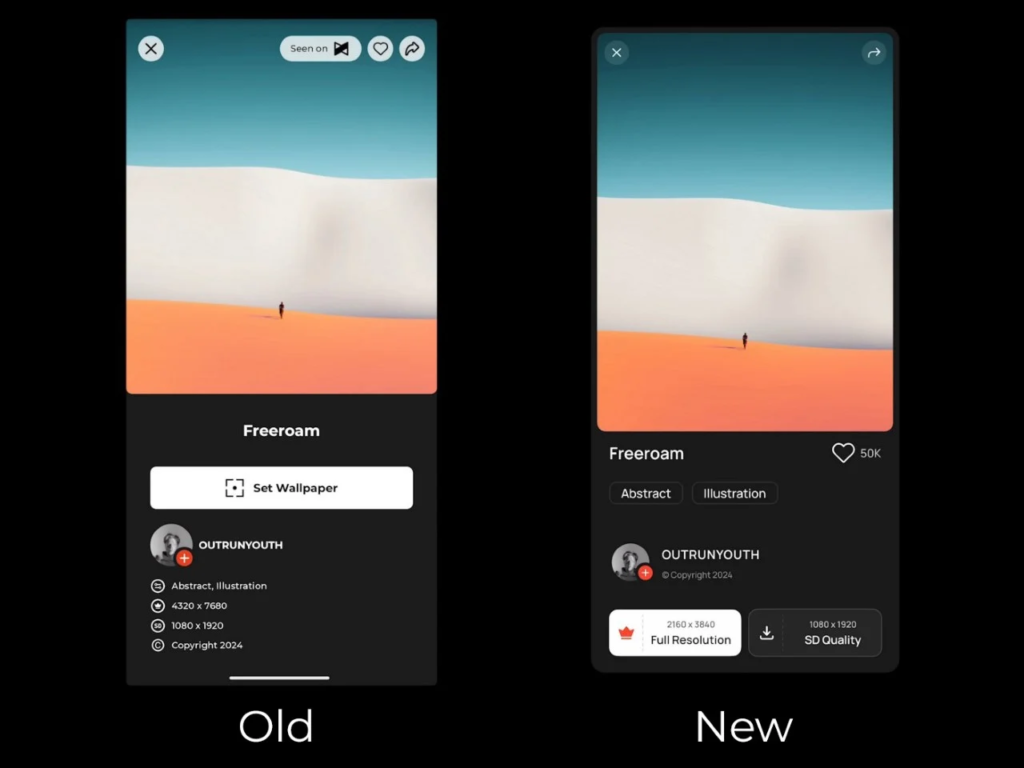
Perhaps the most significant point of contention was the app’s pricing model. Charging $12 a month or $50 a year for wallpaper access (even after adjusting prices due to backlash) seemed excessive, especially when compared to subscriptions for content-rich platforms like Netflix or Spotify. The app also incorporated ads and tracked personal data—surprising choices for a wallpaper app. Users felt locked out of meaningful engagement unless they paid a premium, which seemed out of step with the value offered.
Functional Flaws: Limited Customization and Search Capabilities
Beyond aesthetics and pricing, Panels suffered from functional limitations. Users couldn’t choose whether to apply wallpapers to their home screen, lock screen, or both—a standard feature in most wallpaper apps. The search functionality was restrictive; initiating a new search required abandoning existing filters, and there were no options to sort results by relevance or popularity. For an app predicated on personalization and discovery, these shortcomings hindered user engagement.
The Redesign Revelation: Juxtopposed’s Masterclass in UI/UX
Recognizing these issues, Juxtopposed embarked on a mission to reimagine Panels. Her approach was meticulous, addressing both macro and micro design elements. She proposed a more intuitive onboarding process, allowing users to preview artists’ work or select wallpapers based on themes and moods. The navigation was overhauled for clarity, with consistent iconography and accessible search functionality.
Juxtopposed also tackled the monetization model, suggesting a balance between free content and premium offerings. Instead of a steep subscription fee, she proposed a freemium model with optional in-app purchases, making the app more inviting to new users while still generating revenue.

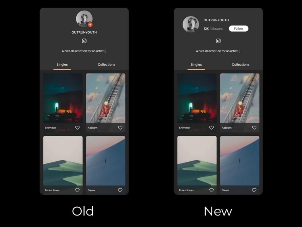
One of her most innovative ideas was transforming Panels into a community-driven platform. By allowing users to create profiles and share their own wallpapers, the app could evolve into a social hub for design enthusiasts—a space reminiscent of OnePlus’s community approach. This not only enhances user engagement but also leverages MKBHD’s extensive follower base, fostering a sense of inclusivity and collaboration.

A Path Forward: Embracing Feedback and Iteration
The Panels app, in its original form, felt more like a promising beta than a finished product. However, with constructive feedback and thoughtful redesigns like those from Juxtopposed, there’s immense potential for growth. By prioritizing user experience, consistency, and fair pricing, Panels can align more closely with the high standards associated with MKBHD’s brand.

In the ever-evolving landscape of app development, listening to the community and embracing iterative design are key. Panels has the foundation of a great app—it just needs refinement. With designers like Juxtopposed illuminating the path forward, the app can transform from a polarizing release into a celebrated tool that resonates with users and upholds the quality we’ve come to expect from Marques Brownlee.
