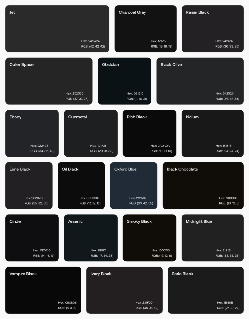
Today, let’s chat about something that’s been on my mind lately – moving beyond the stark contrast of pure white (#FFFFFF) and pure black (#000000) in our UI/UX designs. Don’t get me wrong, these classics have their place, but there’s a whole world of subtle shades waiting to elevate our work!
You know that feeling when you’re scrolling through an app late at night, and the bright white background feels like it’s burning your retinas? Yeah, we’ve all been there. That’s why I’ve been experimenting with softer alternatives, and I’m excited to share what I’ve learned!
For those crisp, clean backgrounds we love, instead of pure white, try these on for size: • Snow (#FFFAFA) • Ghost White (#F8F8FF) • Ivory (#FFFFF0)

These shades offer a softer look that’s easier on the eyes while still maintaining that fresh, clean feel we’re after.
Now, for text and dark UI elements, pure black can sometimes feel a bit harsh. Check out these alternatives: • Jet (#2A2A2A) • Charcoal Gray (#121212) • Rich Black (#0A0A0A)

These options provide depth and sophistication without the intensity of pure black.
But why does this matter? Well, it’s not just about aesthetics (though that’s important too!). Using softer shades can:
Reduce eye strain for users
Create a more inviting interface
Add a touch of personality to your designs
Improve readability, especially for longer text